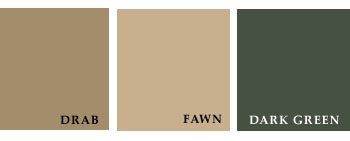
Exterior Color.-For the outside painting of country houses, quiet, neutral tints should generally be chosen. The various shades of fawn, drab, gray, and brown, are all very suitable. All the positive colors, such as red, yellow, blue, green, black, and white, should always be avoided. Nothing can be in worse taste than the very common practice of painting country houses white. This color is glaring and disagreeable to the eye, when presented in large masses; it makes a house an obtrusive and too conspicuous object in the landscape; it does not harmonize with the hues of nature-standing, as it were, harshly apart from all the soft shades of the scene. Use any other color rather than white. Downing makes an exception to this rule in favor of cottages deeply embowered in trees-the shadow of the foliage taking away the harshness and offensiveness of the color; but even in such cases we would modify the white by a slight admixture of chrome yellow and Indian red. Red, another glaring and disagreeable color, is a common one for farm-houses in some parts of the country. It is scarcely less offensive to the eye than white. Perceiving the absurdity of painting country houses white, many have gone to the other extreme, and given their dwellings a too dark and somber hue. Light, cheerful, but unobtrusive colors, harmonizing with the prevailing hues of the country, are most suitable. Take the colors of the various earths, the stones, the trunks and branches of trees, mosses, and other natural objects for your guides and you will not go far wrong. A quiet fawn color or drab and a warm gray-that is, a gray mixed with a very little red and some yellow-are the safest colors to recommend for general use. The browns and dark grays are suitable for stables and out-buildings. A mansion or a villa should have a somewhat sober hue; a house of moderate size a light and pleasant tone; and a small cottage a still lighter and livelier tint. A house exposed to the view should have a darker hue than one that is much hidden by foliage. To produce the best effect, several tints or shades of color should be used in painting the exterior of a house; and it is important that they be judiciously chosen and combined. If the color selected for the main walls be light, the facings of the windows, the roof trimmings, verandas, etc., may appropriately be a darker shade of the same color; and if the prevailing color of the building be dark, a lighter shade should be applied to the trimmings. If Venetian blinds be used, the solid parts of them may be similar in shade to the window casings, but a little darker, and the movable slats darkest of all. If green be preferred for the blinds, it should be a very dark green; light and bright greens having a flashy and disagreeable effect.
2006-12-13